
Climate change is one of the most pressing issues facing humanity and the natural world today. While the phrase “climate change” is used broadly, scientists rely on concrete, measurable indicators—sometimes called “climate indicators”—to diagnose how the Earth’s climate system is changing, how fast it is changing, what parts of the system are most sensitive, and what the likely consequences may be. These indicators help us move from general concern (“the world is warming”) to specific evidence (“these glaciers are receding; sea level is rising; global surface temperature has increased by ~1.2 °C since preindustrial times”) and thus guide responses in policy, planning and adaptation.
In this blog post we will explore in depth the major categories of indicators of climate change: greenhouse gas concentrations and radiative forcing; global and regional temperature changes; cryosphere changes (snow, ice, permafrost); sea level rise and ocean changes; precipitation, droughts and extreme weather; ecosystem and biological responses; and human and societal impacts. For each indicator we will discuss what it shows, how it is measured, what the recent trends are, and why it is important. The goal is to give you a clear, richly detailed picture of how scientists know climate change is happening, how they know humans are responsible for much of it, and what the observable consequences are.
1. GREENHOUSE GASES & ATMOSPHERIC COMPOSITION
One of the foundational indicators of climate change is the atmospheric concentration of greenhouse gases (GHGs). These gases trap heat (longwave radiation) in the Earth atmosphere system, thereby increasing the planet’s energy budget and driving warming. Tracking their levels over time is a direct indicator of the driving force (or “forcing”) behind climate change.
What this indicator is
Greenhouse gases include carbon dioxide (CO₂), methane (CH₄), nitrous oxide (N₂O), and certain halogenated gases (e.g., CFCs, HFCs). They accumulate in the atmosphere (and some in the oceans/land) and contribute to the “greenhouse effect” by absorbing infrared radiation that would otherwise escape to space. Scientists measure their atmospheric concentrations—measured in parts per million (ppm) for CO₂ and parts per billion (ppb) for many others—and use those measurements to calculate how much additional heat they trap (radiative forcing).
In addition, there is the concept of “remaining carbon budget” how much CO₂ humanity can still emit if we are to stay under certain warming thresholds (e.g., 1.5 °C) and also “net emissions” (i.e., emissions minus natural sinks).
How are GHGs measured
Concentrations of greenhouse gases are monitored via a variety of means: ground‐based measurement stations (e.g., the famous Mauna Loa CO₂ record), airborne sampling, satellite remote sensing, and ice‐core proxy records (for long term historical context). Radiative forcing is computed based on the extra energy retained by the Earth system due to elevated GHG concentrations. Emissions are tracked via inventories of fossil fuel combustion, land‐use change, industrial processes, etc.
What the trends show
According to comprehensive updates of climate indicators, human driven emissions are at record high levels: for example, in the decade 20142023 net greenhouse gas emissions averaged about 53 ± 5.4 Gt CO₂ equivalent per year.
The observed global mean surface warming for the same decade was about 1.19 °C [1.06 to 1.30 °C] relative to 18501900 according to Earth System Science Data. Their “2024”update also reported that the best estimate of global surface temperature reached ~1.52 °C (for that year) and reaffirmed that essentially all of the warming is human induced.
In more tangible numbers, atmospheric CO₂ concentration is higher than at any time in at least the last ~800 000 years. For example, the World Meteorological Organization (WMO) recently reported that CO₂ levels reached record highs and the annual increase was the largest since measurements began in 1957. (AP News)
Why measuring GHGs matters
Greenhouse gas concentrations are the root driver of anthropogenic climate change. Without elevated GHGs humanity’s fossil fuel emissions, industrial processes and land use changes, the Earth’s climate would be relatively stable in the absence of major volcanic or solar drivers. That means that by tracking GHGs, we are effectively tracking the “cause” of much of the warming and associated climate change. Because many of those emissions stay in the atmosphere for decades to centuries, the system has inertia meaning that the warming we already have may commit us to further changes even if future emissions decline.
The “remaining carbon budget” concept is critical in climate policy: it indicates how much more CO₂ we can afford to emit if, for example, we aim to limit global warming to 1.5 °C or 2 °C above preindustrial levels. As one news source recently warned: “Only two years left of world’s carbon budget to meet 1.5 °C target” at current emission rates. (The Guardian)
Thus, greenhouse gas concentrations and emissions are essential indicators of where the climate system is headed and what mitigation actions are needed.
2. GLOBAL AND REGIONAL TEMPERATURE CHANGE
Once greenhouse gases increase and trap more heat, a primary consequence is that the Earth’s surface temperature rises. Tracking temperature over land and oceans is one of the most fundamental indicators of climate change. It translates the abstract forcing into a measurable outcome.
What this indicator is
“Global surface temperature” refers to an average across land and ocean surfaces of how much warmer (or cooler) the Earth is in a given period relative to a baseline period (often 1850-1900). Because climate is defined as long‐term averages, scientists examine the trend over decades, and also look at regional temperature changes, heatwaves, temperature extremes, warming rates, and anomalies.
How Global surface temperature is measured
Temperature measurements come from a vast global network of weather stations on land and sea, buoys and ships on the ocean, satellite retrievals (for surface or near‐surface layers), and reanalysis datasets that integrate many sources. Scientists combine these datasets to create global temperature anomaly time series. They also use attribution studies to separate human induced warming from natural variability.
What the trends show
Global surface temperature has risen significantly in the modern era. For example, one recent dataset indicates that the decade average warming (2014-2023) was about 1.19 °C [1.06 to 1.30 °C] above 1850-1900, and that the single year human induced warming for 2023 was about 1.31 °C [1.1 to 1.7 °C]. (Earth System Science Data)
The 2024 update shows an observed best estimate of ~1.52 °C for that year. The warming rate has also accelerated: human induced warming has increased at about 0.26 °C [0.2–0.4 °C] per decade over the last decade (2014-2023).
In addition to global averages, many regions experience enhanced warming (e.g., the Arctic warming several times faster than the global mean). Observations also show a greater frequency of hot extremes, shorter cold seasons, fewer frost days, and warmer nights. The USGS notes that “temperatures are rising worldwide due to greenhouse gases trapping more heat in the atmosphere.” (USGS)
Why Global surface temperature matters
Temperature is perhaps the most intuitive indicator of climate change. It matters for multiple reasons:
- Warming influences weather patterns, evaporation rates, moisture transport, and thus precipitation and droughts.
- Biological systems—plants, animals, ecosystems—are temperature sensitive; many species’ ranges shift in response to warming.
- Many human systems are temperature sensitive: agriculture, health (heat illness), infrastructure (building design, roads, rail).
- Warming modifies feedbacks: for example, melting ice reduces albedo (reflectivity) and accelerates further warming; warmer oceans hold more heat, etc.
By monitoring temperature trends, scientists and policy makers can assess how far the planet has warmed, compare progress (or lack thereof) against global targets (e.g., limiting warming to 1.5 °C), and evaluate the urgency of mitigation and adaptation measures.
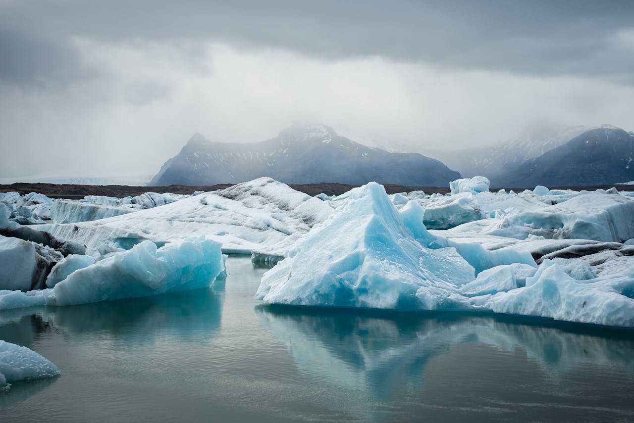
3. CRYOSPHERE CHANGES: SNOW, ICE, GLACIERS, PERMAFROST
The cryosphere the frozen parts of the planet including snow cover, glaciers, sea ice, ice sheets, and permafrost is both a sensitive indicator of warming and a source of important feedbacks in the climate system. Changes in the cryosphere are visible, measurable, and impactful.
What this indicator is
Key cryosphere components include:
- Glaciers and ice caps: Mountain glaciers that shrink in area and volume.
- Sea ice (Arctic and Antarctic): The extent, thickness, and seasonality of ice covering oceans.
- Snow cover (seasonal): The extent and persistence of snow across land.
- Ice sheets: The massive Greenland and Antarctic ice sheets, their mass balance (gain vs. loss).
- Permafrost: Soil or sediment that remains frozen year round; its thawing releases greenhouse gases and changes ground stability.
How the cryosphere is measured
Glacier mass loss is measured by field surveys, remote sensing (satellite altimetry, gravimetry), and in some cases modelling. Sea ice extent is measured by satellite microwave sensors, which provide daily or monthly maps of ice coverage. Snow cover can be measured via satellite and ground observations; the timing of melt and freeze matters too. Ice sheet mass changes can be measured by GRACE (Gravity Recovery and Climate Experiment) satellite gravimetry and altimetry. Permafrost changes are tracked via boreholes, ground sensors, remote sensing (if available), and modelling of thaw depth and extent.
What the trends show
Many indicators point to rapid cryosphere changes. The USGS lists melting glaciers, decreasing snowpack, and increasing rate of sea ice loss as clear signs of climate change. (USGS) NASA’s climate indicators note that global sea level has risen eight to nine inches since reliable recordkeeping began in 1880; this rise is strongly linked to melting ice and warming oceans. (NASA Earthdata)
For example, Arctic sea ice extent has been shrinking for decades, both in summer minimum and winter maximum. Glacier retreat is nearly ubiquitous for mountain glaciers globally. Permafrost thaw is accelerating in high latitudes, releasing methane and CO₂ and sometimes causing ground subsidence or infrastructure damage. Snow cover days are decreasing in many regions; melt occurs earlier in spring, reducing alpine water stores.
Why it matters
Cryosphere changes matter in multiple ways:
- Water supply: Many regions (especially mountainous and cold region ones) depend on seasonal snow and glacier melt for freshwater in the dry season. Shrinking snowpack or glaciers threaten those resources.
- Sea level rise: Melting ice sheets and glaciers, plus thermal expansion of warmer ocean water, contribute to sea level rise (discussed in the next section).
- Albedo feedback: Ice and snow are highly reflective; when they shrink, more solar energy is absorbed by darker surfaces (ocean, land), accelerating warming (a positive feedback).
- Habitats: Polar and alpine ecosystems depend on cold conditions and ice; as those habitats shrink, species may be lost or forced to migrate.
- Infrastructure and human systems: Thawing permafrost can damage buildings, roads, pipelines; less stable terrain; earlier snowmelt can increase flood risk.
- Greenhouse gas release: Permafrost holds large amounts of organic carbon. When thawed, decomposition releases CO₂ and CH₄, further amplifying warming.
Thus the cryosphere provides both a “canary in the coal mine” for warming and a series of feedbacks that accelerate climate change.
4. SEA LEVEL RISE AND OCEAN CHANGES
The world’s oceans and seas are central to the climate system: they absorb heat, store carbon, influence weather and circulation, and respond to warming and other changes. Indicators related to sea level and ocean heat content are thus critical for understanding climate change.
What this indicator is
Key ocean related indicators include:
- Global mean sea level: The average height of the ocean surface (relative to land or geoid) globally, rising over time as a result of thermal expansion and ice melt.
- Ocean heat content: How much heat the oceans have absorbed over time, often measured for different layers (e.g., 0700 m, 7002000 m).
- Ocean acidification: The lowering of ocean pH as CO₂ dissolves in seawater, forming carbonic acid, which affects marine organisms and ecosystems.
- Sea surface temperature (SST) and ocean warming: Higher SST is a surface indicator; deeper ocean warming is a key buffer and storage of excess heat.
- Changes in ocean circulation: Slowing or shifting of major currents (though detecting those changes is more complex).
How sea level is measured
Sea level is tracked via tide gauges historically and satellite altimetry more recently; ocean heat content is measured via arrays of floating sensors (e.g., the Argo program), satellite measurements, and oceanographic cruises; ocean acidification is measured via insitu chemical sensors, water samples, and pH monitoring; SST is measured via satellites and ship/float observations; circulation changes require more advanced instrumentation and modelling.
What the trends show
Sea level has risen significantly. NASA’s indicators site reports an 8–9 inch (≈2023 cm) rise since 1880, with the rate accelerating in recent decades. (NASA Earthdata) Ocean heat content has been increasing steadily: a Wikipedia summary suggests that over 90 % of the Earth’s excess energy from global warming is stored in the oceans, and that warming has penetrated to depths below 700 m. (Wikipedia)
Additionally, reports indicate that warming seas and higher sea levels are combining to increase coastal flooding, storm surge risk, and ecosystem stress (e.g., coral reefs). Ocean acidification is also occurring, with lowered pH affecting calcifying organisms.
Why it matters
There are multiple reasons these changes matter:
- Coastal risk: Rising sea levels increase risk of coastal flooding, erosion, salt intrusion, and threaten low lying islands and coastal cities.
- Heat storage: The oceans act as a massive heat sink, moderating surface warming so increases in ocean heat mean a large latent store of warming committed. Warming deeper oceans has implications for circulation, marine ecosystems, and future climate.
- Island nations and low coast communities: Sea level rise threatens livelihoods, infrastructure, freshwater sources, human displacement.
- Marine ecosystems: Warmer, more acidic oceans put coral reefs, shellfish and other marine life at risk; disruption of marine food chains impacts fisheries and food security.
- Feedback loops: Warming oceans can release methane hydrates, reduce oxygen levels, accelerate polar ice melt (via warming adjacent seas).
- Decay of the “thermal inertia” cushion: Because the oceans hold so much heat, even if emissions decline, the stored heat will continue to drive changes for decades to centuries. As such, ocean and sea level indicators are crucial for understanding long term commitments.
5. PRECIPITATION PATTERNS, DROUGHTS, FLOODS AND EXTREME WEATHER
Warming is not just about higher average temperatures. It affects the hydrological cycle, precipitation patterns, the frequency and intensity of droughts and floods, as well as other extreme weather events (heat waves, storms, wildfires). These are key indicators of climate change in action.
What this indicator is
Climate change indicators in this category include changes in:
- Precipitation amounts and variability: how much rain or snow falls, how often, and how unevenly.
- Drought frequency and severity: longer dry spells, more intense droughts.
- Floods and heavy precipitation events: more intense rainfall over shorter durations, increasing flood risk.
- Heat waves and hot extremes: number of days of extreme heat, duration of heat waves, high nighttime temperatures.
- Storms/hurricanes/typhoons: while attribution is complex, there is evidence that warming oceans increase potential intensity of tropical cyclones.
- Wildfires: higher temperatures and drier conditions increase wildfire risk and severity.
How PPT is measured
Precipitation and drought indicators are measured via rainfall gauges, satellite remote sensing, hydrological models, drought indices (e.g., Palmer Drought Severity Index), streamflow and soil moisture monitoring. Heat waves are measured by temperature time series and extreme event statistics (e.g., number of days above a threshold). Storm statistics come from meteorological agencies; wildfire extent and severity are tracked via satellite and ground observations.
What the trends show
The USGS summarises some of these shifts: rising temperatures, less snowpack, glaciers melting faster, sea ice melting faster, and more extreme climate events such as heat waves and heavy rainstorms. (USGS) The EPA’s “Climate Change Indicators” project lists many indicators under “Weather & Climate” including extremes of heat, heavy storms, drought, etc. (EPA)
In many regions, rainfall patterns are changing: some areas are experiencing more heavy rainfall events, even as overall dry spells lengthen. For example, a recent news item highlighted that in India 2025 monsoon season had above‐average rainfall in many districts, with fewer rainy days but more intense precipitation events. (The Times of India)
Heat waves are becoming more frequent, more intense and longer in duration; regions that rarely experienced certain extremes are now encountering them. Droughts in semiarid regions are getting worse as evaporation increases and precipitation patterns shift. The hydrological cycle therefore is being altered—more moisture in the atmosphere (due to warming), but also more erratic rainfall, more evaporation, more potential for extremes.
Why PPT matters
Changes in precipitation and extreme weather matter for many reasons:
- Water availability: Droughts threaten agriculture, drinking water supplies, hydropower, and energy production.
- Food security: Crops depend on regular rainfall, seasonal snow/ice melt, soil moisture. When these change, yields can decline, planting seasons shift, risk of crop failure increases.
- Infrastructure & disaster risk: Flooding, heavy rainfall and storms damage infrastructure; heat waves stress energy systems, cause air conditioning demand surges, increase mortality.
- Ecosystem stress: Many ecosystems are sensitive to moisture regimes; shifts in precipitation or increased extremes can push ecosystems beyond thresholds, trigger tree mortality, insect outbreaks, wildfire.
- Human health: Heat waves increase heat related illness and deaths; floods and droughts influence vector borne disease, waterborne disease; more extreme weather events raise the risk of disasters and displacement.
- Economic cost: Extremes cost more. Adaptation, reconstruction, disaster relief all impose economic burdens.
Thus tracking these hydrological and extreme weather indicators is vital to understanding how climate change is already affecting, and will increasingly affect, societies and ecosystems.
6. ECOSYSTEM AND BIOLOGICAL RESPONSES
Beyond the physical indicators (temperature, sea level, ice, precipitation), climate change also leaves fingerprints in living systems: how plants, animals, ecosystems and biodiversity respond can serve as indicators of change. These responses show that warming is not just a theoretical concept but has real ecological consequences.
What this indicator is
Ecosystem‐level indicators of climate change include:
- Shifts in species range and migration: many species are shifting poleward or upward in elevation in response to warming.
- Changes in phenology: earlier spring blooms, shifts in timing of migration, reproduction and flowering.
- Tree mortality and forest dieback: stress from drought, heat, pests combined with warming leads to tree mortality and reduced forest health.
- Coral bleaching and reef decline: warmer ocean temperatures cause coral bleaching, death and reduced resilience of reef ecosystems.
- Changes in ocean biota: warming and acidification affect plankton, shellfish, fish distribution, and marine biodiversity.
- Wildfire regime changes: increased wildfire frequency and severity alter ecosystems, vegetation types and cycle of regeneration.
How ecological indicators are measured
Ecological indicators are measured via long term ecological monitoring plots, satellite vegetation indices (e.g., NDVI), species distribution records, phenological records (flowering dates, migration arrival/departure), forest health surveys, reef monitoring programs, and fisheries data. For some ecosystems, remote sensing provides broad coverage; for others, local field data is essential.
What the trends show
According to the EPA’s “Indicators” site, under the “Ecosystems” category there are metrics such as bird wintering ranges shifting, tree mortality increasing, wildfires, lake and stream temperatures rising, etc. (EPA) The 2022 report for California, for example, lists indicators including forest tree mortality, vegetation distribution shifts, wildfires, lake water temperature, glacier change, snow water content among others. (OEHHA)
Marine ecosystems are under enormous stress. Coral reefs globally are undergoing increasingly frequent bleaching events as sea surface temperatures exceed thresholds; this is a clear biological indicator of climate forcing. Some researchers argue that the collapse of warmwater reefs may already represent a tipping point in the climate ecosystem system. (TIME)
Terrestrial ecosystems are shifting. Tree species that were once stable at certain altitudes are migrating higher; pests and bark beetle outbreaks in forests are exacerbated by warmer winters and drought stress; wildfire regimes are changing and increasing tree mortality.
Why it matters
Ecosystem and biological indicators matter for multiple reasons:
- They provide evidence of actual, living system responses to climate change, not just physical variables. This helps show that climate change is already exerting pressure on the biosphere.
- Biodiversity, ecosystem services (pollination, water purification, carbon sequestration) and human livelihoods are intimately tied to ecosystem health. When species distribution or ecosystems shift, human systems that depend on them are affected.
- Some ecological responses may be irreversible or take very long time to recover, meaning that ecosystems lost or permanently changed may not return.
- Ecosystems can also feed back into the climate system (e.g., forests store carbon; if they die or burn, carbon is released). So biological change is not only a consequence but also part of the dynamic.
From a policy and adaptation perspective, knowing how ecosystems are changing helps inform conservation, land‐use planning, species management and ecosystem resilience strategies.
7. HUMAN AND SOCIETAL IMPACTS
While much climate change indicator work focuses on physical and ecological changes, the human dimension is also important. Indicators that reflect how climate change is affecting human systems health, agriculture, infrastructure, livelihoods are key to understanding the full picture of climate change and its urgency.
What this indicator is
Human‐system climate indicators include:
- Heat related health outcomes: increasing heat related illness or mortality, fewer cold‐related deaths but more heat related ones.
- Growing season length and shifts in agriculture: changes in planting dates, crop yields, pest/disease regimes, crop variety suitability.
- Energy demand and building performance: e.g., more cooling degree days, more air conditioning use, strain on power grids.
- Water supply and availability: changes in freshwater resources, groundwater depletion, shifting streamflow timing, salt intrusion in coastal aquifers.
- Disaster losses and cost: economic losses due to floods, storms, droughts, wildfires; displacement of communities; insurance claims.
- Infrastructure vulnerability: damage to roads, rail, ports, buildings due to sea level rise, permafrost thaw, heat, extreme storms.
How it is measured
These indicators are measured via health statistics, agricultural yield datasets, energy consumption data, water resource monitoring, economic damage reports, insurance data, infrastructure risk assessments, demographics of displacement, etc. Many of these indicators are collated nationally or regionally, and sometimes globally by entities such as the United Nations, the World Bank, etc.
What the trends show
For example, the EPA’s “Climate Change Indicators” include sections on “Health & Society” covering metrics such as heat and cold related deaths, occupational heat‐related illness, the operation of vector‐borne disease, wildfire smoke exposure, etc. (EPA) In the California 2022 indicators report, “Impacts on human health” included heat‐related deaths and illnesses, occupational heat illness, vector‐borne diseases, wildfire smoke, etc. (OEHHA)
Globally, as surface and air temperatures increase, heat waves are more frequent and severe, leading to increased occurrences of heat stroke, dehydration, cardiovascular stress. Changes in water availability and crop viability are already affecting livelihoods, especially in rural and vulnerable regions. Coastal population exposure to sea level rise and storm surge is increasing. Low‐income communities often bear the brunt of climate impacts due to fewer adaptation resources.
Why human activity matters
Climate change is not an abstract problem—it directly affects people’s lives, health, economies and societies. These indicators provide:
- A measure of how prepared societies are (or are not) for climate impacts.
- Evidence of who is vulnerable and where adaptation efforts must be prioritized.
- The basis for policy decisions: where to invest in infrastructure, which communities to protect, how to adjust agriculture, how to manage health systems for heat and vector diseases.
- A sense of the cost of inaction: the higher the losses, the more urgent mitigation and adaptation become.
Human and societal indicators tie the science of climate change to human well‐being and serve as a bridge between environmental system changes and policy, development and fairness.
PUTTING IT ALL TOGETHER: FEEDBACKS, TIPPING POINTS AND THE CARBON BUDGET
While each category of indicator above provides a piece of the story, it is important to understand how they interconnect. Climate indicators are not independent; many of them are linked by feedbacks, by thresholds (tipping points), and by the concept of a carbon budget that limits how far we can safely go.
Feedbacks
Feedbacks are processes in the climate system that either amplify (positive feedback) or diminish (negative feedback) the effects of an initial forcing. Several indicators reveal where feedbacks are in play:
- Ice‐albedo feedback: Declining ice and snow (cryosphere change) means darker surfaces (ocean, land) absorb more heat, which in turn causes more melt.
- Permafrost carbon feedback: Warming and thawing permafrost release CO₂ and methane, adding to GHG concentrations, thereby driving further warming.
- Ocean heat uptake: As oceans warm, they absorb less heat (because warmer water holds more energy per degree warming) and may slow circulation. That has implications for how much excess heat remains in the atmosphere.
- Vegetation/forest feedbacks: Drought stress, tree mortality, forest fires reduce land carbon sinks, meaning more CO₂ remains in the atmosphere.
These feedbacks mean that some of the indicators are not just passive logs of change, but active components of accelerating change.
Tipping points
A tipping point in the climate system is a threshold beyond which a small change in forcing triggers a large, possibly irreversible change in the system. Some indicators suggest we may be approaching or have crossed certain tipping points. For instance:
The collapse of warmwater coral reefs, as one article reports, may be a tipping point already passed. (TIME)
There are concerns about the stability of major ice sheets (Greenland and Antarctica) and the possibility of abrupt sea level rise.
The weakening or collapse of major ocean circulations (like the Atlantic Meridional Overturning Circulation) is considered a potential tipping element. (arXiv)
Indicators help monitor approaching tipping points: increased variability, slower recovery from disturbances, abrupt changes in trends.
Carbon budget
The remaining carbon budget is the amount of CO₂ humanity can still emit if we are to have a reasonable chance of staying under a given temperature threshold (e.g., 1.5 °C). Indicators of greenhouse gas concentrations, emissions, and warming trends all contribute to calculating how much budget remains. A news item recently warned that the remaining carbon budget to stay under 1.5 °C may be nearly exhausted. (The Guardian)
Tracking this budget is crucial for policy: it tells us how much “room” is left for emissions and how urgent mitigation must be.
CHALLENGES & CAVEATS IN INTERPRETING INDICATORS
While these indicators are powerful and compelling, there are important caveats and challenges in how they are interpreted, communicated and used for decision making.
Attribution and variability
Climate systems have natural variability (solar cycles, volcanic eruptions, El Niño/La Niña, internal oscillations). Disentangling how much of a change is due to human forcing vs natural variability requires statistical attribution studies. Many of the indicators (temperature rise, extreme event frequency) require long time series and rigorous analysis. The USGS notes we have “very high confidence” in some trends (e.g., temperature rise) because of multiple lines of evidence. ([USGS][5])
Regional versus global
While global indicators tell the broad trend, climate change impacts are highly regional and local. Some regions may warm faster, others slower; precipitation patterns may increase or decrease depending on geography. Thus global averages hide important local details. Local data may be less robust (fewer stations, poorer records) in some parts of the world (including parts of Africa).
Measurement and data quality
Some indicators are measured confidently (e.g., atmospheric CO₂) while others are more difficult (e.g., deep ocean heat content, permafrost carbon release). Data gaps, changing measurement techniques, and methodological changes must be accounted for. Indicators like ecosystem response or species shift have even more variability and may have confounding factors (landuse change, invasive species, pollution) besides climate change.
Timescales and lag effects
Many climate change effects have lag times—e.g., the ocean will continue warming even if emissions stop; ice sheets may take centuries to fully respond; ecosystems may take decades to adapt. This means that even when indicators show change, some effects are “committed” but not yet fully manifested. This creates both urgency and complexity in planning.
Communication and threshold interpretation
Setting thresholds (e.g., “we must stay under 1.5 °C”) means we need indicators to track how close we are. Yet many variables cross thresholds gradually, and some tipping points may be abrupt but hard to forecast. Indicators provide trends, but predicting exactly when a system will tip is difficult. Also, communicating risk and uncertainty to non specialists is challenging.
WHAT THE INDICATORS COLLECTIVELY TELL US ABOUT CLIMATE CHANGE
Putting the indicators together gives us a coherent narrative of what is happening—and what is at stake. Some key takeaways:
The planet is warming, and that warming largely stems from human activities (GHG emissions, land use change). Indicators of atmospheric composition, radiative forcing and temperature all support this.
Many components of the climate system (cryosphere, oceans, hydrological cycle) are responding to that warming. Indicators show melting ice, rising seas, warming oceans, changing precipitation, more extremes.
Ecosystems and human systems are already feeling the effects of climate change. Indicators of species shifts, coral bleaching, tree mortality, heat related illness, agricultural shifts show that this is not just a future projection—it is current reality.
The pace of change is accelerating. Indicators such as the rate of warming per decade, or the accelerating rate of sea level rise, suggest we are moving faster than many models predicted.
Feedbacks and interlinked systems mean that many changes are locked in or accelerating; the indicators of ocean heat content, ice melt, permafrost thaw suggest that even if emissions drop, some changes will continue.
The remaining carbon budget is shrinking. Indicators of emissions, concentrations, and warming trends show that the window for limiting warming to 1.5 °C or even 2 °C is getting narrower.
For many regions especially in Africa and the global South—the indicators imply high vulnerability: changes in precipitation, drought, heat, ecosystem shifts have strong implications for livelihoods, health, food security, water security.
Adaptation and resilience are required. Indicators help show where the vulnerabilities are and track progress or lack thereof in responses.
In short: the evidence from multiple independent indicators is overwhelmingly consistent with the conclusion that our climate is changing, that humans are the dominant cause, and that those changes have and will increasingly have significant consequences for the planet and human societies.
IMPLICATIONS FOR POLICY, ACTION AND MONITORING
What do the indicators imply for policy makers, planners, communities and individuals? Here are some key implications drawn from the indicator trends.
For mitigation
Since greenhouse gas concentrations and emissions are a root driver, reducing emissions remains foundational. Indicators show that emissions are still high and we are edging close to, or have exceeded, some temperature thresholds. Policy must ramp up to achieve substantial emission reductions and these must happen quickly. Indicators also help policy track progress (or lack thereof) in emission reductions and GHG concentrations.
For adaptation
Indicators of temperature change, precipitation shifts, sea level rise, extreme weather, ecosystem shifts all point to the need for adaptation. Communities must plan for higher temperatures, changed rainfall patterns, heavier storms, sea level rise, ecosystem stress, etc. Monitoring these indicators locally (regional downscaling) is critical so that adaptation is targeted and timely.
For resilience & equity
Since impacts are already occurring and will become more intense, strengthening resilience (of ecosystems, infrastructure, human systems) is vital. Indicators help identify vulnerable regions, ecosystems or communities. For example, high rates of tree mortality, ecosystem shifts, or coastal flood indicators can prompt investment in resilience measures. Especially in Africa, this means building resilient agriculture, water systems, health infrastructure, early warning systems.
For monitoring & early warning
Indicators serve as early warning. By tracking tipping‐point related indicators (permafrost thaw, ice sheet mass balance, ocean circulation changes) we can hope to detect early signs of abrupt change. Monitoring needs to be improved globally, especially in under observed regions (like parts of Africa, the deep ocean, some cryosphere regions).
For communication
Indicators translate abstract climate change into tangible, measurable changes. Communicating these effectively helps public understanding and support for action. For instance: “Sea level has risen X cm since 1880; this means a storm surge that used to reach one block will now go two blocks inland” makes the data real.
For integrated policy
Climate indicators cross sectors: energy, water, agriculture, infrastructure, ecosystems, health. Policy must therefore be integrated. Indicators help show interplay (e.g., how water and heat stress affect agriculture, how sea level rise affects urban planning).
HOW TO INTERPRET CLIMATE INDICATOR GRAPHS AND DATA
- For readers who may encounter climate indicator dashboards, how should one interpret them? Here are some tips
- Look at long time periods, not just year to year fluctuations. Climate is long term; natural variability can mask trends over short periods.
- Watch rates of change, not just levels. A temperature increase of 1 °C over 100 years is different to 1 °C over 10 years. Indicators often show acceleration (steeper slopes) which is more alarming.
- Understand baselines: Many indicators show “anomalies” relative to a baseline period (e.g., 1850- 1900). Knowing the baseline helps interpret the anomaly size.
- Attention to uncertainty: Many datasets include ranges or error margins. Recognizing uncertainty doesn’t mean ignoring the trend—it means we are confident in the trend but precise numbers may vary.
- Multiple indicators are better than one: No single indicator tells the whole story. Temperature, sea level, ice, ocean heat, precipitation together build a robust case.
- Regional context matters: Global indicators are useful, but local data is essential for adaptation. Local trends may diverge from global averages.
- Watch for nonlinear change: Some indicators may move gradually, others may shift rapidly once a tipping point is approached. Keep an eye on early warning signs (e.g., increased variability, longer recovery times).
SUMMARY OF MAJOR INDICATORS AND KEY POINTS
Here’s a summary of the major categories and key takeaway points:
- Greenhouse gases & atmospheric composition: Root driver; CO₂, CH₄ rising; radiative forcing increasing; remaining carbon budget shrinking.
- Global/regional temperature change: Planet warming; ~1.21.5 °C above preindustrial levels; warming accelerating; regional variation matters.
- Cryosphere (ice, snow, glaciers, permafrost): Ice retreats, snow cover declines, permafrost thaws; major feedbacks; visible signs of change.
- Sea level & ocean changes: Sea level rising (≈20 + cm since 1880), ocean heat content increasing, acidification noted; longterm commitment.
- Precipitation, droughts, extreme weather: Water cycle intensifying; more heavy rainfall, more severe droughts; shifting rainfall patterns; increased extremes.
- Ecosystem/biological responses: Species shifting ranges, phenology changing, coral reefs bleaching, tree mortality rising; ecosystems already impacted.
- Human & societal impacts: Health risks, agriculture stress, water supply changes, infrastructure vulnerability, economic losses; climate change is a human challenge.
- Feedbacks/tipping points / carbon budget: Indicators show that feedbacks are active, tipping points may be approaching or crossed; carbon budget is dwindling; urgency is increasing.
THE VALUE OF INDICATOR DASHBOARDS & WHAT TO WATCH OUT FOR
Many agencies (e.g., United States Environmental Protection Agency –EPA, United States Geological Survey–USGS, Copernicus Climate Change Service, Global Change Research Program) maintain indicator dashboards. For example, EPA’s “Climate Change Indicators” page shows dozens of indicators across greenhouse gases, weather & climate, ocean & coasts, snow & ice, ecosystems, health & society.
As someone interested in climate issues (or working in policy, development, business, academia), you should watch:
- Updated rates of warming (global, regional)
- Emissions and concentrations of GHGs
- Sea level rise trend and its acceleration
- Glacier mass balance/sea ice extent trends
- Ocean heat content and depth penetration
- Changes in extreme weather frequency/intensity (heat waves, heavy rainfall)
- Drought/flood indicators in vulnerable regions
- Ecosystem health – for example tree mortality, coral reef bleaching, species shifts
- Human system indicators – e.g., heat related deaths, crop yield anomalies, infrastructure damage
- Early warning signs of tipping points (e.g., permafrost thaw, ice sheet stability, circulation changes)
- Remaining carbon budget estimates and how they evolve with emissions trajectory.
ROLE OF LOCAL/REGIONAL INDICATORS AND ADAPTATION RELEVANCE
While global indicators provide the big picture, local and regional adaptation require down scope indicators. For Uganda, East Africa and Africa generally, key indicators might include:
- Local rainfall, drought and flood trends; storage of water in lakes/reservoirs; snow/glacier (where applicable) meltwater trends in mountains.
- Shifts in growing season, crop suitability zones, pest/disease incidence changes.
- Heat related mortality and morbidity, especially in urban areas; vector borne disease range shifts (e.g., malaria, dengue) with warming.
- Water resource indicators: groundwater levels, streamflow timing, lake levels.
- Ecosystem indicators: tree species composition shifts, forest health, wildfire risk, migration of fauna/flora, wetland changes.
- Urban/coastal indicators (for African coastal cities): sea level rise, coastal erosion, saline intrusion, storm surge risk.
- Energy demand indicators: cooling/heating degree days, power grid stress, infrastructure vulnerability.
Regional monitoring helps decisionmakers target adaptation investments, anticipate risks and plan accordingly. Indicators must be contextualized (e.g., local climate history, socioeconomic vulnerability). Data gaps may be larger in Africa than in better monitored regions; hence investing in local monitoring systems is important.
WHAT’S NEXT? (EMERGING INDICATORS AND FUTURE MONITORING)
As the climate system continues to evolve, some indicators are emerging and will gain importance:
- Deep ocean changes: As monitoring improves, we will better track heat stored below 2000 m, changes in deep ocean circulation, and how that influences climate over centuries.
- Permafrost carbon release: More detailed measurement of permafrost carbon stocks, thaw rates, and emissions of CH₄/CO₂.
- Largescale tipping indicators: Better early warning indicators for icesheet collapse, ocean circulation collapse, rainforest dieback.
- Compound extreme events: Indicators tracking not just single extremes (heat, drought) but combinations (e.g., heat + drought + fire) which have amplified impacts.
- Human ecosystem feedbacks: Indicators of how ecosystem change (forest dieback, species loss) feed back into climate forcing (carbon release) or reduce resilience.
- Social vulnerability indices: Integrating climate indicators with socioeconomic data to create composite indicators of vulnerability and risk.
- Earth system datasets: More integrated indicators that link atmosphere ocean land cryosphere biosphere systems to reflect the interconnections.
Monitoring, data sharing, remote sensing, citizen science, and improved modelling will all help sharpen these indicators, increase their reliability and help in early detection of change.
CONCLUSION
In summary, the suite of climate change indicators gives us a multifaceted and compelling picture of how our planet is changing. From rising greenhouse gas concentrations to warming temperatures, melting ice, rising seas, extreme weather, shifting ecosystems and human impacts—the evidence is robust and convergent. These indicators are not merely academic: they shape our understanding of how far we have come, how quickly we are changing, how much more change is “locked in,” and where we must act.
For the world as whole, these indicators are of direct relevance. They highlight the shifts that must be anticipated changes in rainfall, more frequent droughts or floods, increased heat, ecosystem stress and they underscore the need for local monitoring, adaptation planning and resilience building.
Moving forward, the indicators will continue to evolve, become more detailed, and perhaps bring early warning of abrupt changes. But the core message is already clear: the climate system is changing, and the changes are measurable, increasing in pace, and material for human systems. Action both mitigation and adaptation is urgent. Indicators help us track that action, assess progress (or lack thereof), and inform what needs to be done next.
